Shankar Dayal

MAGAZINE DESIGN

THE CRYSTAL GOBLET

THE CRYSTAL GOBLET

“The Crystal Goblet” by Beatrice Warde, published in 1932, beautifully illustrates typography’s role as a vessel for content.

Using the metaphor of a clear crystal goblet, Warde argues for design that is transparent, functional, and unobtrusive, allowing the text to shine through. This seminal essay continues to inspire designers, emphasizing the importance of readability and the art of conveying meaning with clarity.

MAGAZINE DESIGN

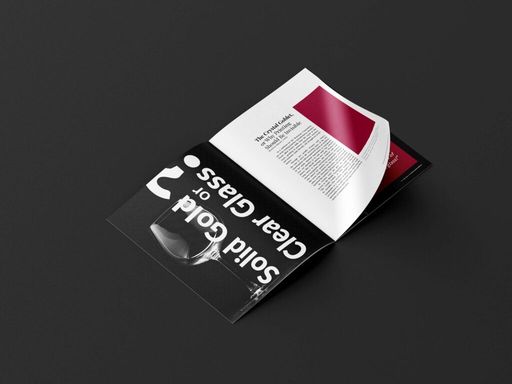
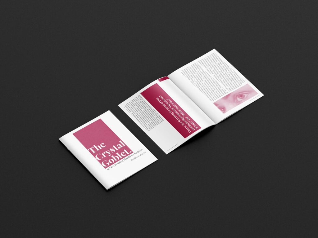
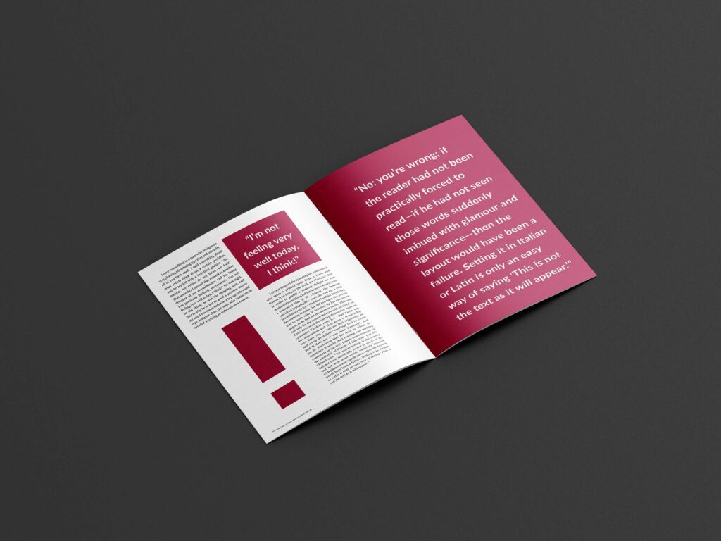
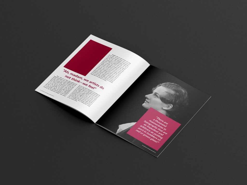
The crystal goblet debate centers on typography, and I’ve designed this magazine to be both legible and experimental.

The aim is to create a magazine with an innovative layout and color scheme, demonstrating that clarity and readability of a design can be maintained even when not adhering to traditional design principles.

Semester Review Presentation Spring 2021
Diwali Festival Poster